Organization
Vireo
Role
Lead Animator and Creative Director
Vireo needed a cohesive brand motion graphics kit to engage eco-conscious individuals aged 18–34 interested in sustainable technologies, green living, and environmental conservation. Capturing the attention of millennials and Gen Z viewers requires a fresh, modern, and uplifting visual identity that resonates with their passion for environmental issues and innovative solutions.
Designing the Motion Graphics course required meeting institutional and industry standards while accommodating students with varying digital literacy and limited software access. The unification of 12 colleges necessitated a standardized curriculum that still addressed diverse needs. Additional complexities included inconsistent attendance, different learning styles, and creating course materials without prior examples.
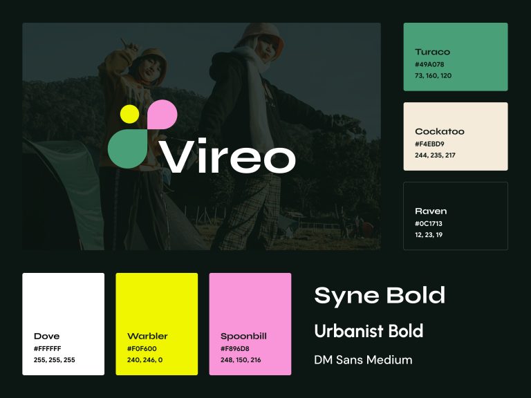
I researched competitor channels to identify elements that resonate with the target audience. Emphasizing sustainability and innovation, I chose earthy tones with vibrant accents to avoid clichés. Using accessible Google Fonts like Syne and Urbanist ensured ease of use. The logo featured geometric shapes and bird motifs for a modular, animatable icon. Focusing on accessibility, I made colors and typography legible and user-friendly. Motion design incorporated the logo’s elements for seamless, engaging animations.
I began by researching YouTube channels like Future Proof and MKBHD to understand what appeals to eco-conscious millennials and Gen Z viewers. Future Proof aligned with Vireo’s sustainability ethos, while MKBHD demonstrated engaging graphic design and motion graphics that resonate with a tech-savvy audience. Personal insights into brands like Everlane, Patagonia, and Tesla—known for sustainability and innovation—informed the design direction.

I created detailed storyboards to plan the motion sequences, meticulously mapping out each second of the animation. The storyboard included descriptions of animations, transitions, and the timing of visual elements. This preparation ensured a smooth animation process and alignment with the brand’s messaging.

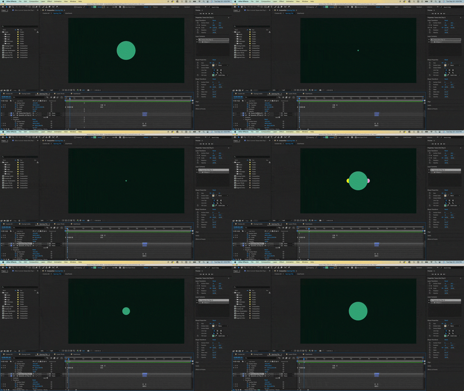
Using Adobe After Effects, I animated the logo and graphical elements, focusing on smooth transitions inspired by Slack’s brand graphics and Compass. The modular logo allowed geometric shapes to collapse, expand, and orbit, symbolizing fluidity and movement. Animations featured circles forming flight patterns to mimic birds, shutter-like transitions for dynamic movement, and linear wipes to reveal text and images. Looping animations ensured a cohesive visual flow, reinforcing themes of sustainability and continuity.

To enhance the animations, I selected audio elements aligning with the brand’s tone. Canary chirps were used at the beginning and end to symbolize the “canary in the coal mine,” emphasizing environmental urgency. Uplifting, natural sound effects complemented visual transitions without overpowering the content. Synchronizing sounds with movements increased engagement and reinforced the narrative.
The final deliverables included a comprehensive brand motion graphics kit with animated logos, opening titles, lower thirds, transitions, and end screens designed for Vireo’s YouTube channel and digital platforms. I created a cohesive visual identity that resonates with the target audience by integrating thoughtful research, strategic design, and meticulous animation. The project successfully balanced sustainability, innovation, and technology themes, resulting in engaging content that supports Vireo’s mission to inspire eco-conscious individuals.


Lower Third

Data Visualization

Video End Card