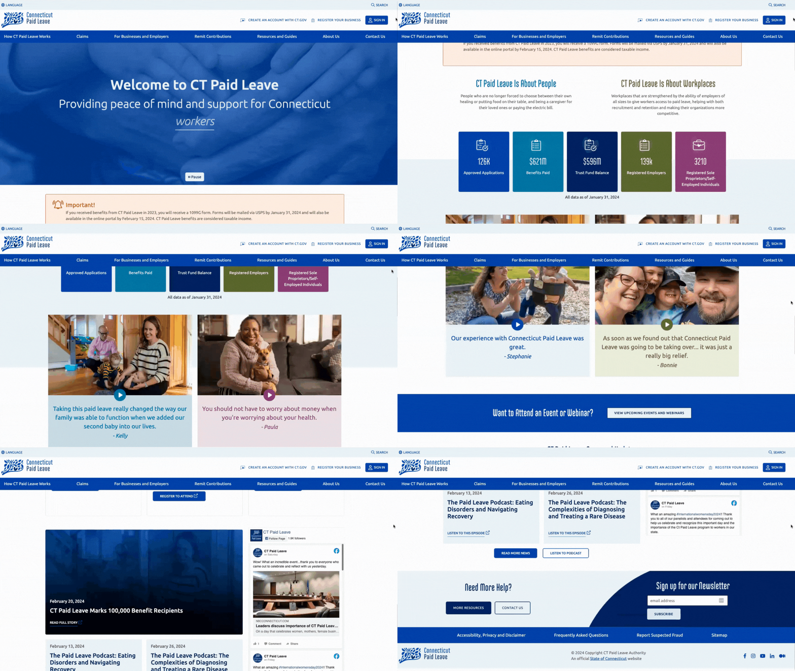
Organization
CT Paid Leave Authority
Role
Lead UX/UI Designer and Accessibility Consultant
Platform
Sitecore
The Connecticut Paid Leave (CTPL) program needed a digital overhaul to better support workers, families, and professionals in navigating the state’s paid leave policies. A high rate of claim denials, often due to incomplete or misunderstood documentation, highlighted the need for a more accessible, user-friendly website.
* Due to a non-disclosure agreement, information on this project is limited.
Collaborators: Tyler Technologies
The original CTPL website was difficult to navigate and resulted in a high number of claims being denied, mainly due to users submitting incomplete documentation. Our goal was to create an accessible and intuitive platform that easily guided users through the claims process.
We proposed creating a new website centered around user needs. This decision was based on a comprehensive analysis of a year’s CTPL program data and call center staff insights. Additionally, user interviews and usability testing were conducted to ensure the website was intuitive and easy to navigate.
We began by analyzing the high rate of denied claims, with 40% of denials caused by incomplete document submissions. Through user research and empathy mapping, we developed eight key personas, such as Elena, a worker needing clearer guidance. This research helped shape the strategy for simplifying the user journey and addressing key pain points.
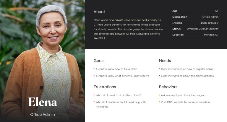
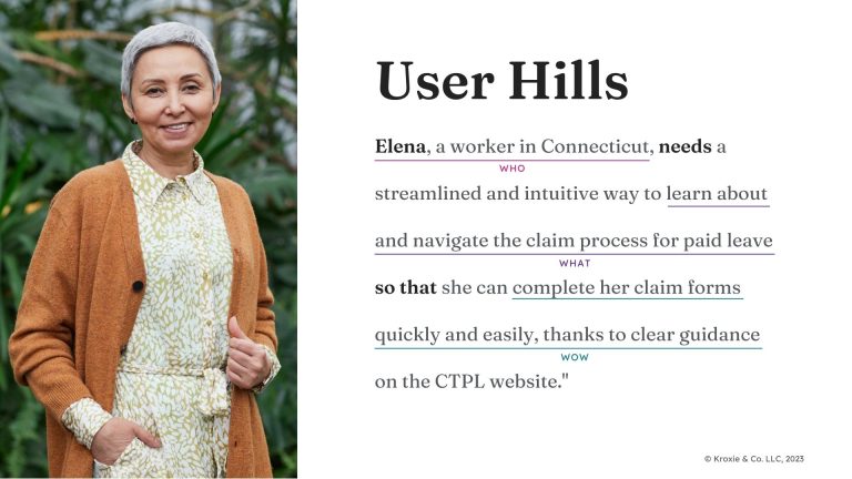
After gathering insights, we restructured the information architecture to create a clearer, more intuitive layout. We organized content into core sections like “How CTPL Works,” “Claims,” and “Businesses & Employers” to improve user flow.
We developed 22 wireframes to map out the layout of these pages, focusing on simplicity and accessibility. Each wireframe was iterated based on feedback to ensure they met user needs.
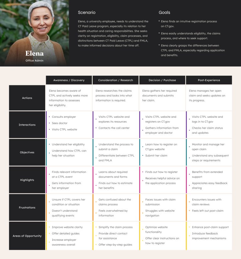
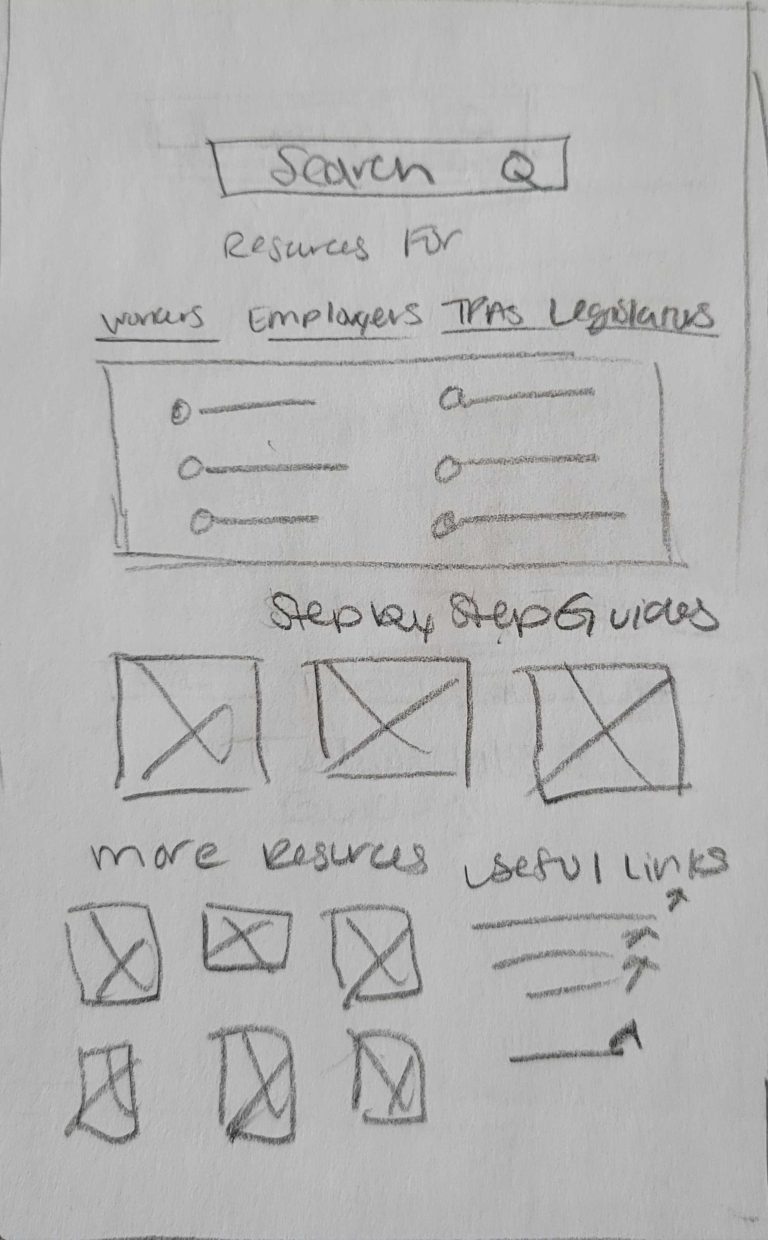
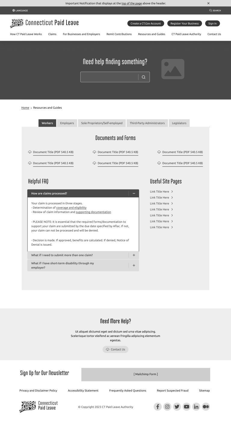
Once wireframes were finalized, we created a 24-page high-fidelity prototype with realistic visuals to simulate the final website. This prototype was used for remote usability testing, where participants completed tasks and shared feedback.
Feedback emphasized simplifying the language and improving clarity, which led to further refinements in the design.
Using feedback from testing, we developed a design system that firmly focused on accessibility. Built with Sitecore’s reusable components, the system ensured all elements were easily managed and met accessibility standards.
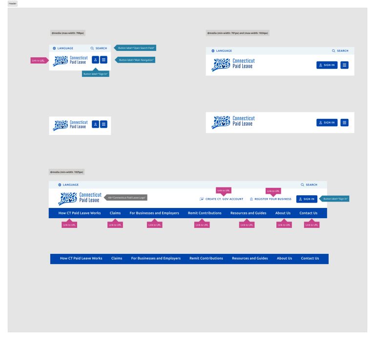
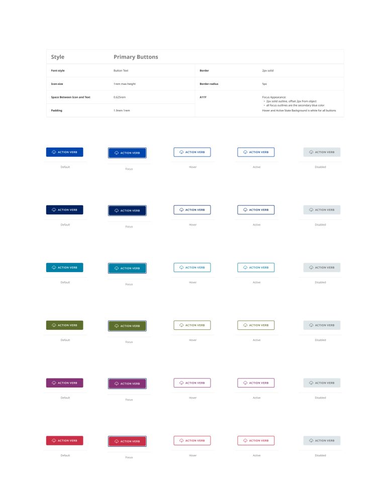
The redesigned CTPL website is now a fully responsive, accessible platform that provides step-by-step instructions for claim submission. The improvements resulted in a better user experience and reduced claim errors.
