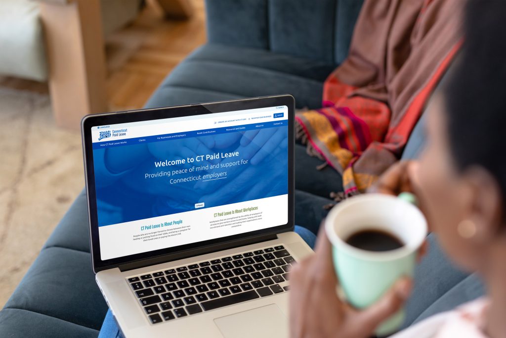

Duration: 1 Year, Launched September 2023
Industry: Government and Public Sector
Target Audience: Connecticut’s workers, families, small business owners, and human resources, healthcare, and social work professionals.
The Connecticut Paid Leave program serves as a vital support for the state’s workforce, especially during significant life events. In collaboration with NIC CT (Tyler Technologies), we aimed to transform the program’s digital experience. Our project focused on developing an accessible, intuitive online platform that simplifies the process of navigating Connecticut’s paid leave policies.
Contributions:
The Connecticut Paid Leave (CTPL) program faced a challenge with a high rate of claim denials, mainly due to incomplete document submissions. As a quasi-government entity adhering to strict web accessibility guidelines, our goal was to overhaul the CTPL website for ADA compliance, improve process clarity, and enhance user education for effective navigation and resource utilization.
We proposed creating a new website centered around user needs. This decision was based on a comprehensive analysis of a year’s CTPL program data and call center staff insights. Additionally, user interviews and usability testing were conducted to ensure the website was intuitive and easy to navigate.
Getting to know your brand and audience.
Finding ways to help your audience.
Brainstorming tangible solutions with you and your team.
Creating visuals that resonate with your brand and audience.
Refining visuals and ideas through feedback and iteration.
Launching a minimum viable product for your audience.
I began by diving into the Connecticut Paid Leave Program’s mission and requirements, aiming to understand their goals and the challenges they faced.
Core Challenges:
Project Goals:
I initiated user research online, exploring external mentions of CT Paid Leave and consulting with friends, family, and the program’s call center staff to document frequent user pain points.
Additionally, I conducted a thorough website audit, presenting my findings to stakeholders. This audit categorized issues as design-related, content-related, or development/CMS-related. From this analysis, I assisted the client in determining a feasible level of compliance and provided formal recommendations for improvements.
For many team members, this was their first web design project. I aimed to familiarize them with the process, sharing resources on design thinking. I prepared accessible educational materials to guide the client in content curation, focusing on transitioning from PDFs to more accessible text-based content. I also advised them on the best way to create and maintain content in multiple languages.
We started by utilizing Mural to create user empathy maps in design thinking sessions. Next, we developed user personas, refining them through multiple iterations to establish 2-3 website goals per user.
The extensive user journey mapping involved stakeholders from finance to the call center. We pinpointed key improvement areas after reviewing website analytics and internal feedback.
I encouraged the client to gather examples of similar websites for inspiration. We analyzed these sites to generate ideas for the site’s information architecture and sitemap updates.
As the team developed the content, I designed layouts and wireframes to better showcase this information, with multiple sessions dedicated to reviewing these wireframes.
After conducting an accessibility audit on CTPL’s Brand Guidelines, I used them to establish the online design system. We identified about 24 key pages for the prototype, applying brand styling and linking screens to create a functional website prototype.
I outlined the test process and worked with CTPL to establish goals and create user scenarios. I designed an email sequence for the client to recruit participants and established a Calendly link, accommodating diverse schedules with after-work session options. This approach was crucial in facilitating broad user participation and garnering insightful feedback.
I meticulously wrote a script to ensure uniformity and thoroughness across all test sessions. The 30-minute sessions were recorded and moderated, with participants articulating their thoughts and me posing supplementary questions.
The feedback was synthesized into a comprehensive report, with recommendations presented to stakeholders, leading to design revisions and preparation for developer handoff.
After finalizing the design, I added accessibility annotations and created detailed specifications in Figma. I also prepared a Confluence document detailing custom component functionality.
Throughout the build, I conducted periodic checks, a post-build accessibility audit, and documented findings for the development team. Once revisions were made and rechecked, the website was set for launch.